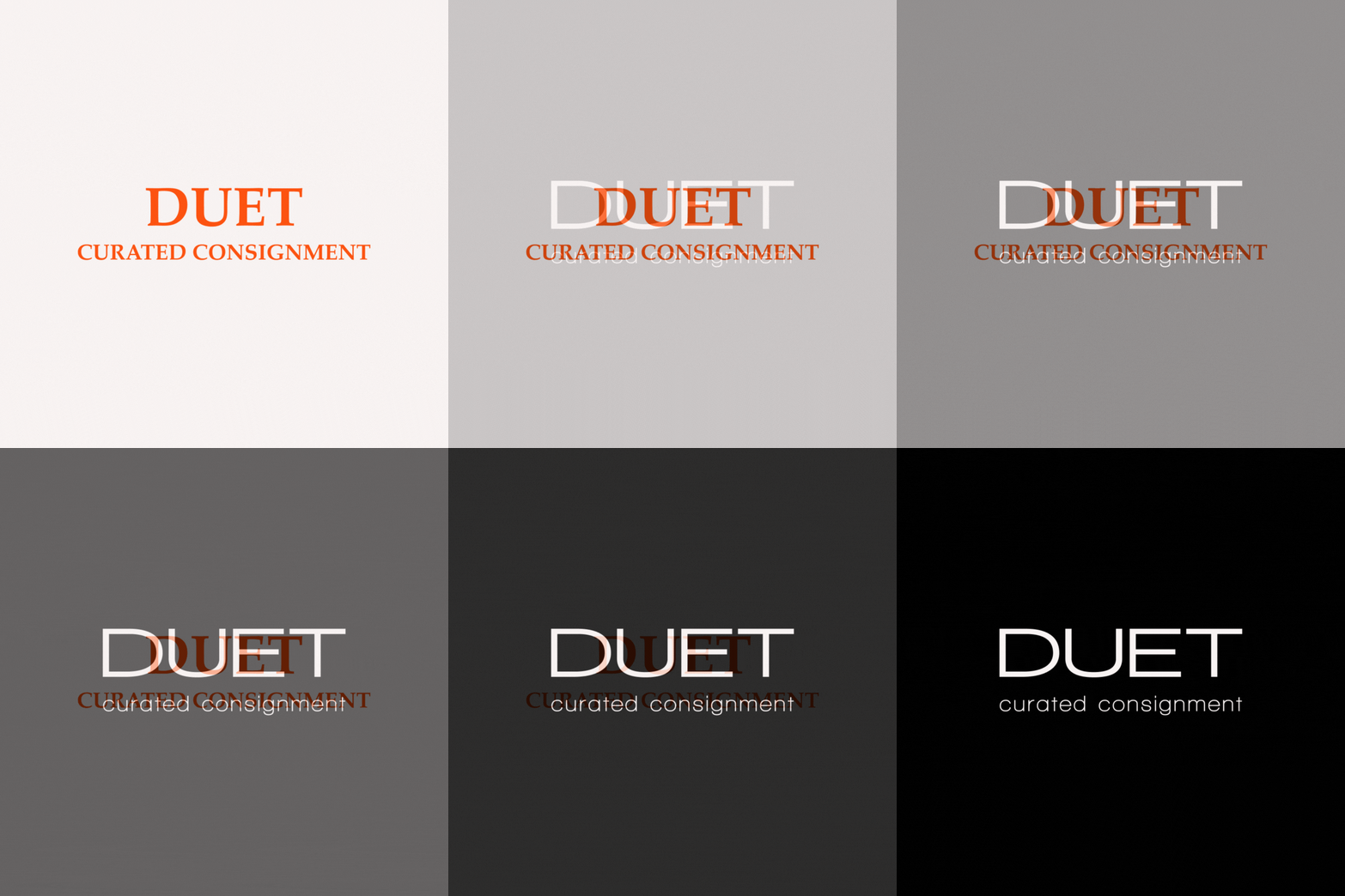
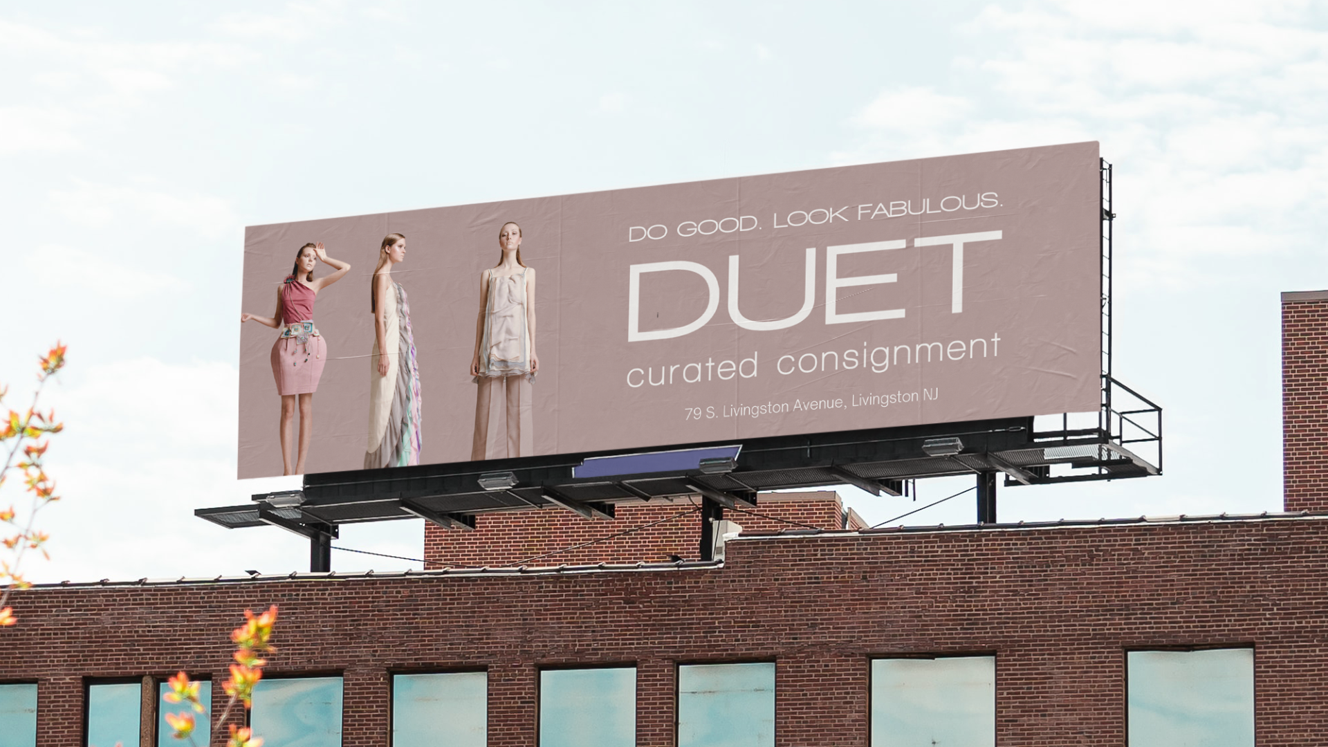
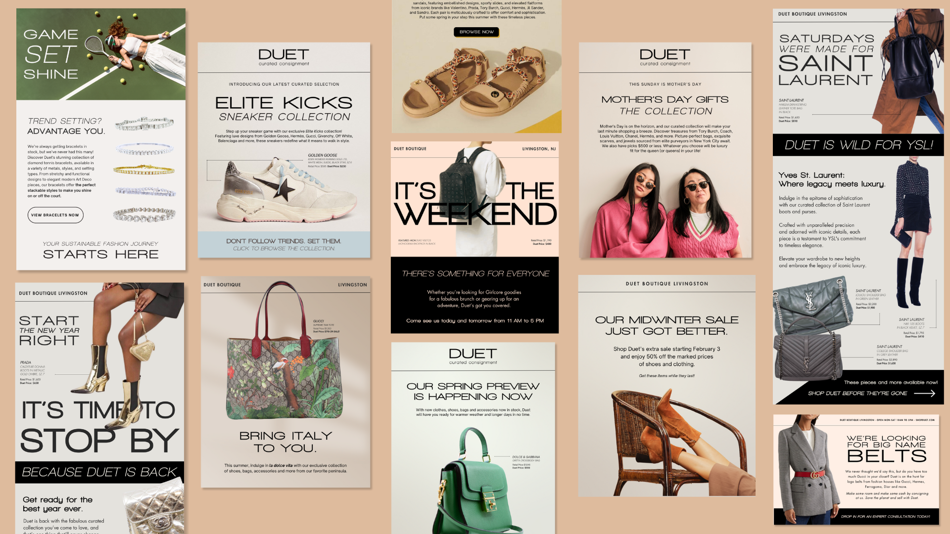
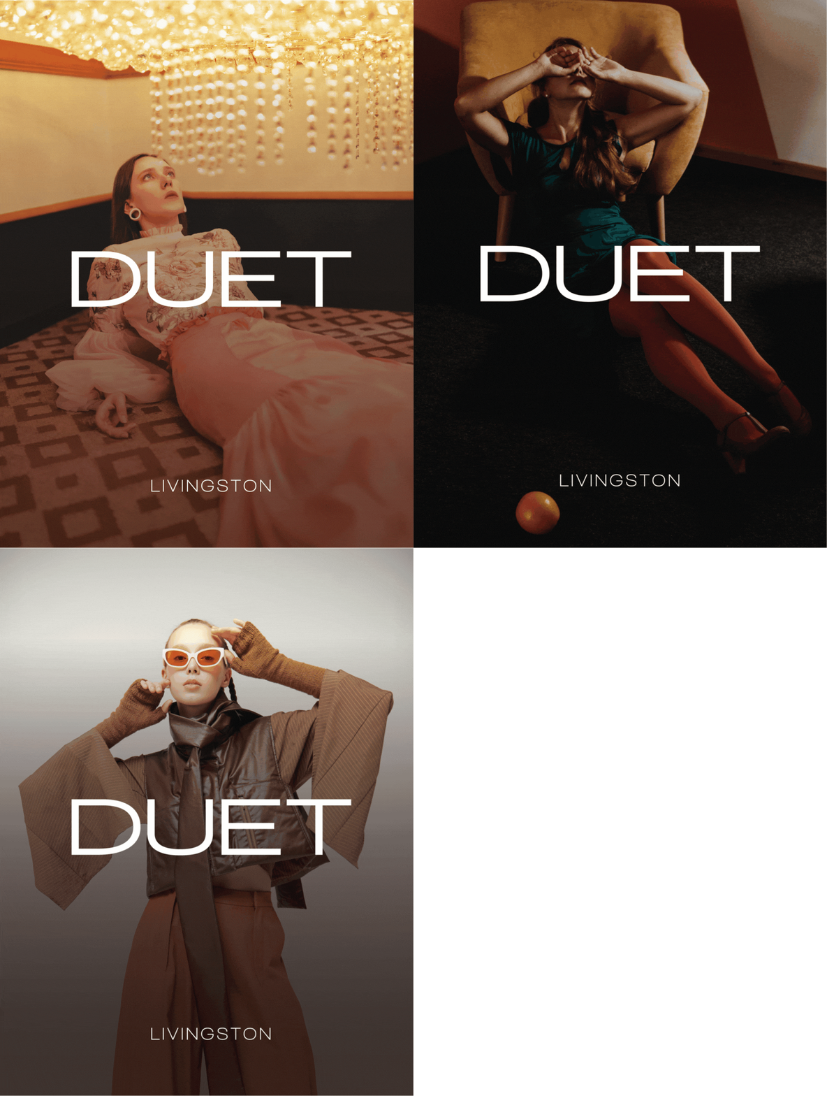
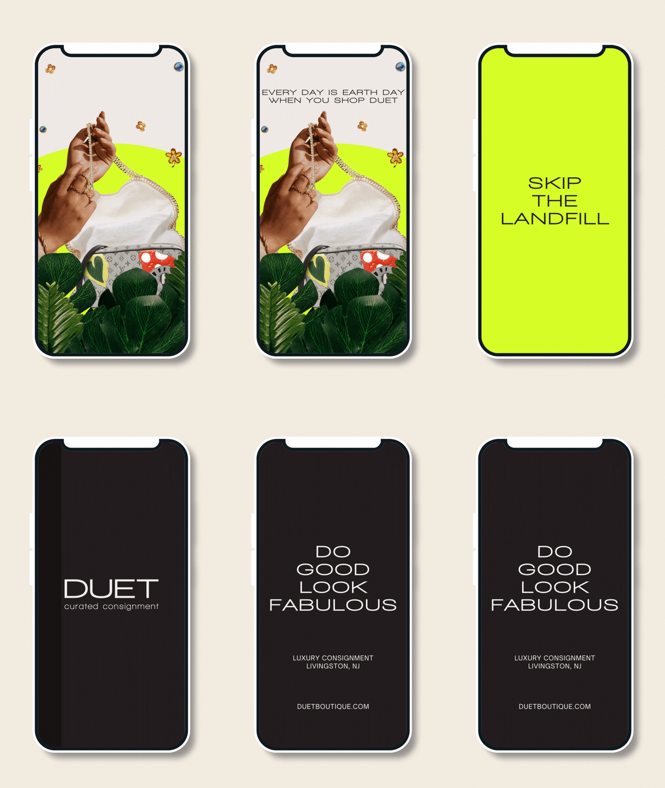
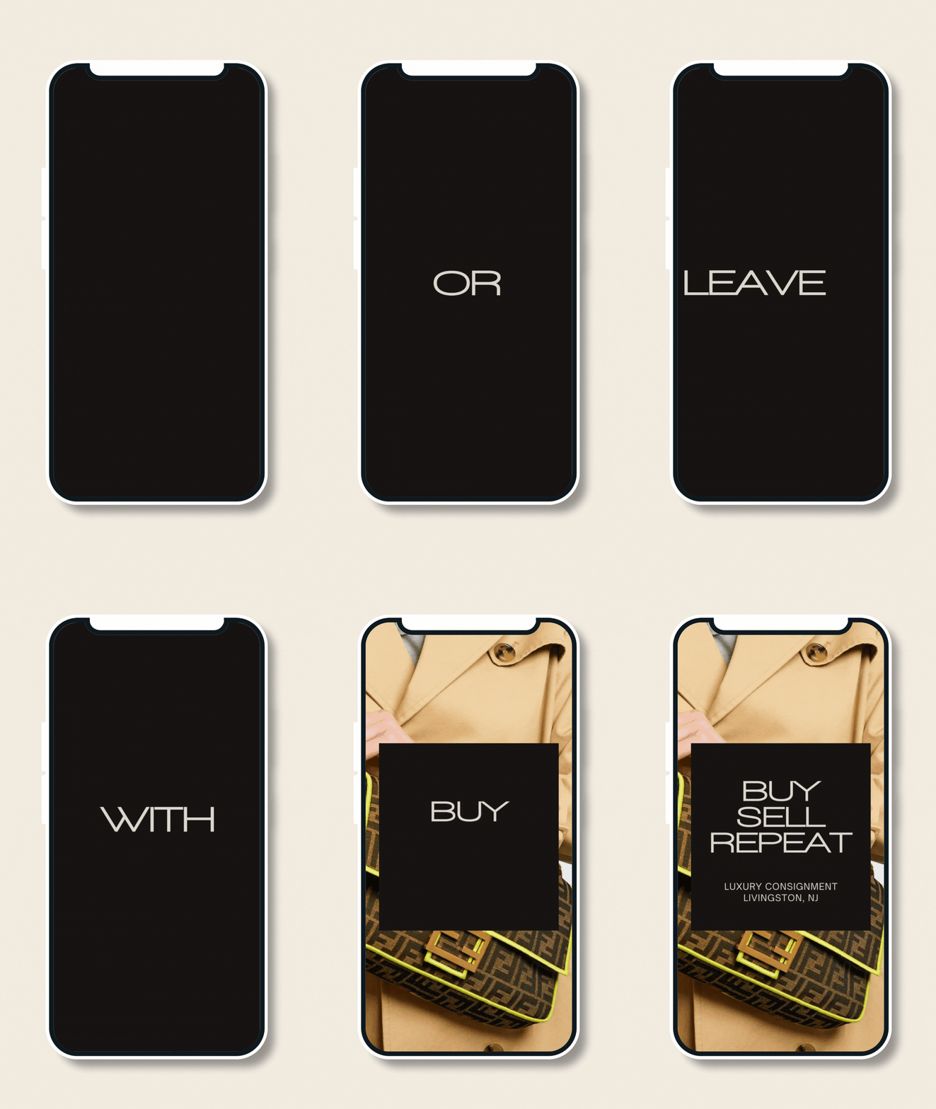
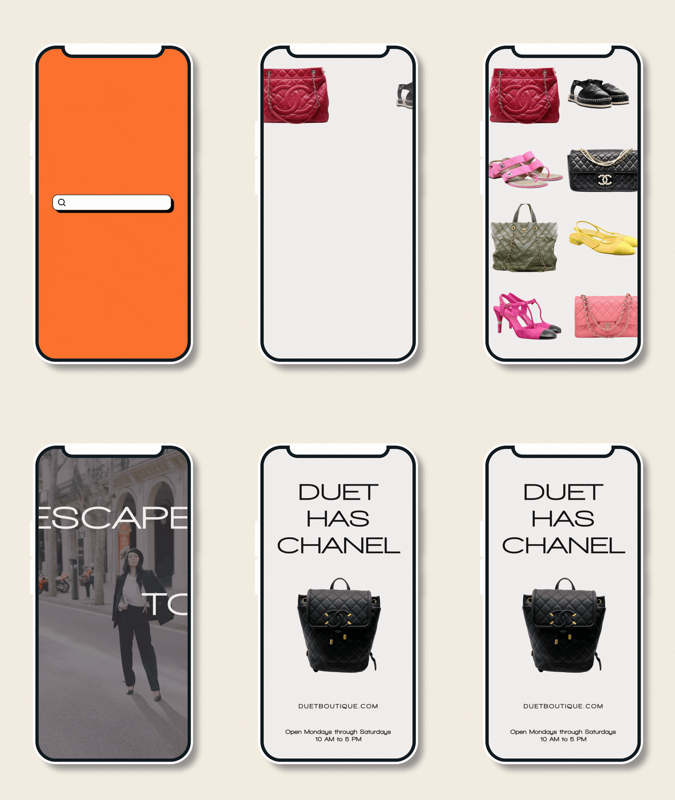
We set out on a mission to elevate Duet’s legacy as a luxury fashion retailer in the greater NYC metro area. The goal? To deliver a rebrand that’s bold, sleek, and effortlessly upscale. We designed a new logo that speaks to timeless style while pushing Duet forward as the premier destination for high-end fashion lovers. This wasn't just about a fresh coat of paint, but about reinforcing Duet’s position in luxury consignment.
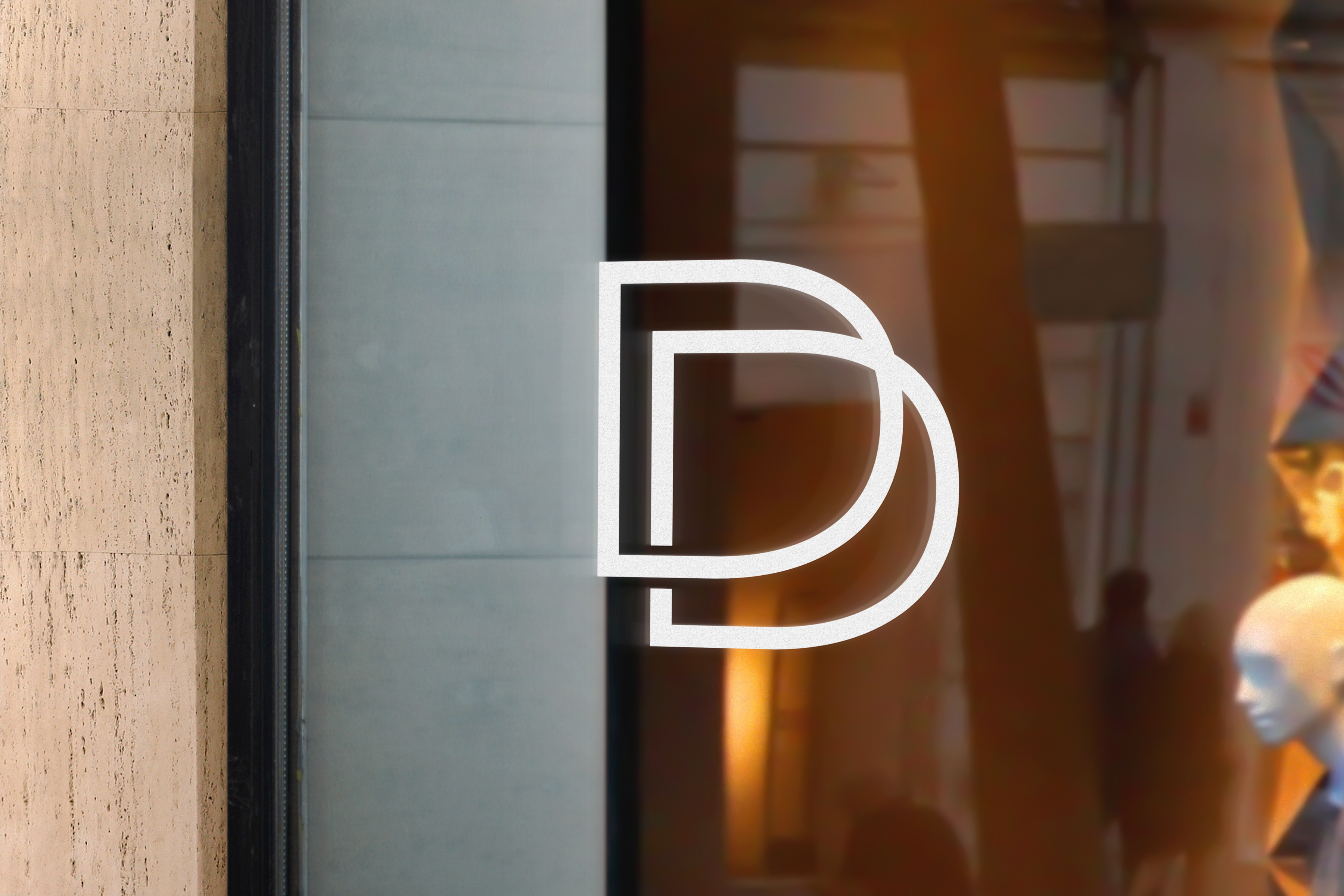
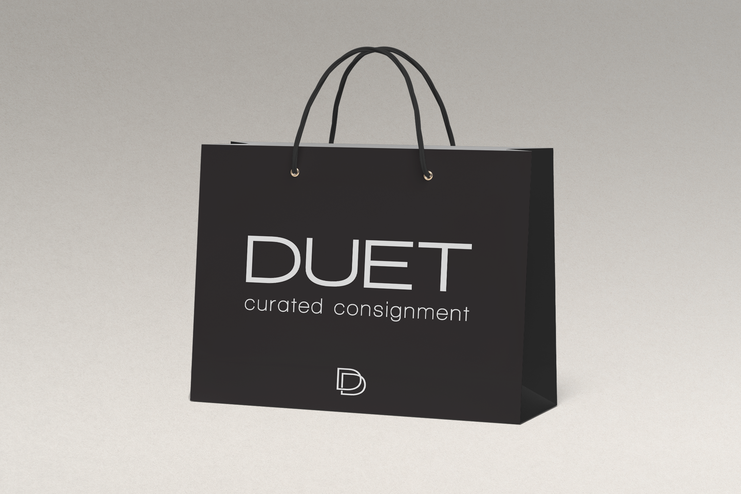
The result? A bold new wordmark with clean, precise lines that reflect the quality of luxury goods and give a subtle nod to the runways that bring couture to the world. Duet's former bow icon was replaced with a sharp interlocking monogram, taking inspiration from iconic fashion houses like Louis Vuitton and Gucci. It’s versatile, perfect for solo use or as part of a pattern.
Working with MAVE to reshape our brand was a game-changer. The new look brought in younger shoppers, energized our staff, and elevated the boutique’s luxury feel. The team was able to breathe into our business, and we couldn’t be happier with the results. They were imaginative, full of ideas, and truly understood our vision in ways we hadn’t even considered. This evolution was something we dreamt of for years and it was incredible to watch it come to fruition, especially after the pandemic.
Lynn Meisler
Owner, Duet Curated Consignment
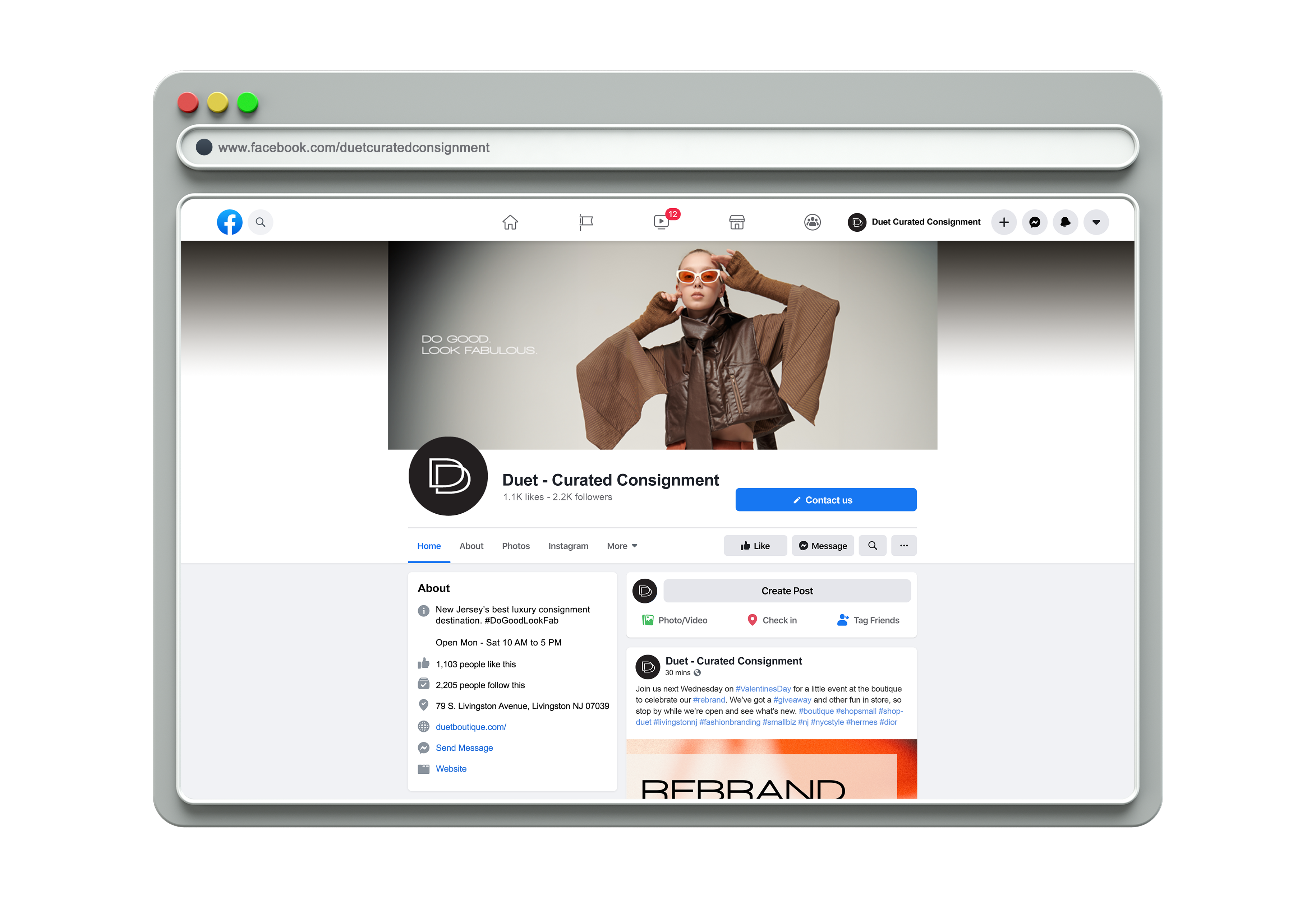
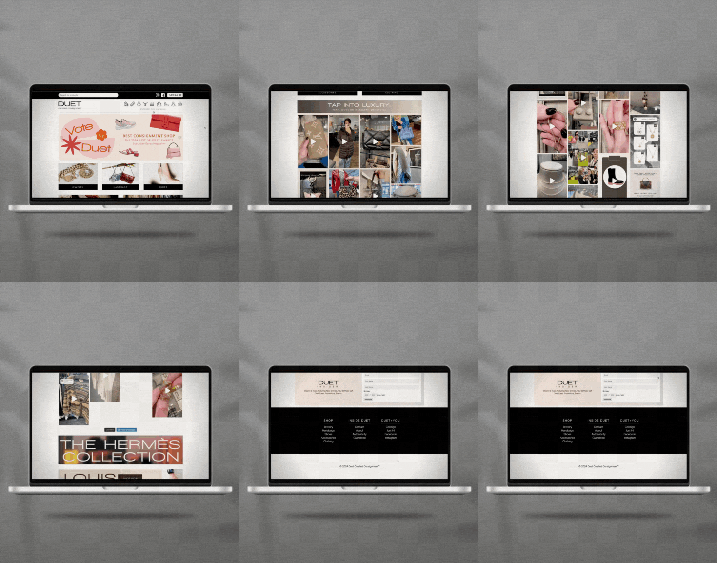
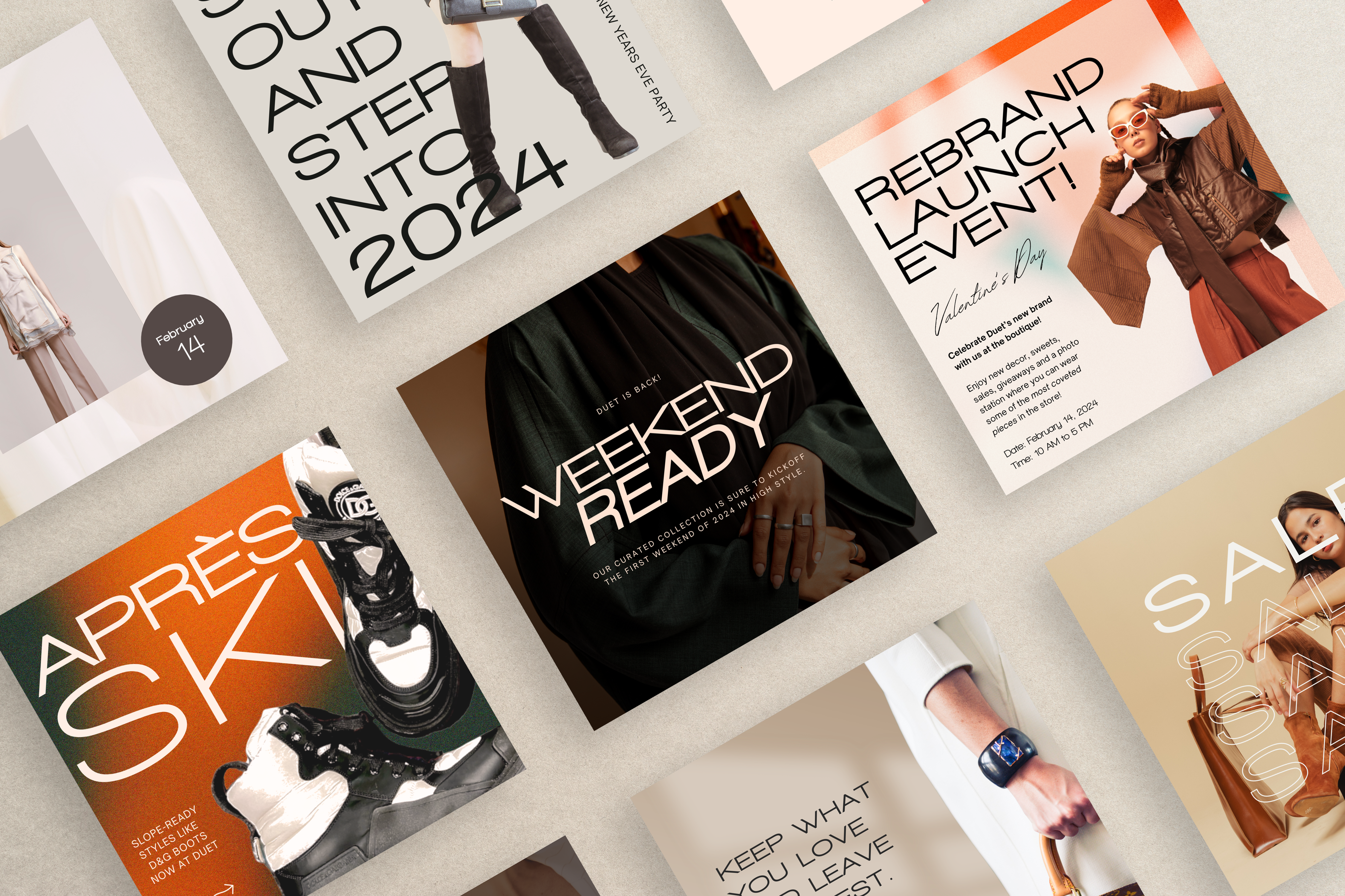
A key goal of this rebrand was attracting a younger, mission-minded audience. To do that, we amplified Duet’s social media presence, prioritizing Instagram Reels to break through the noise and stop the endless scroll.
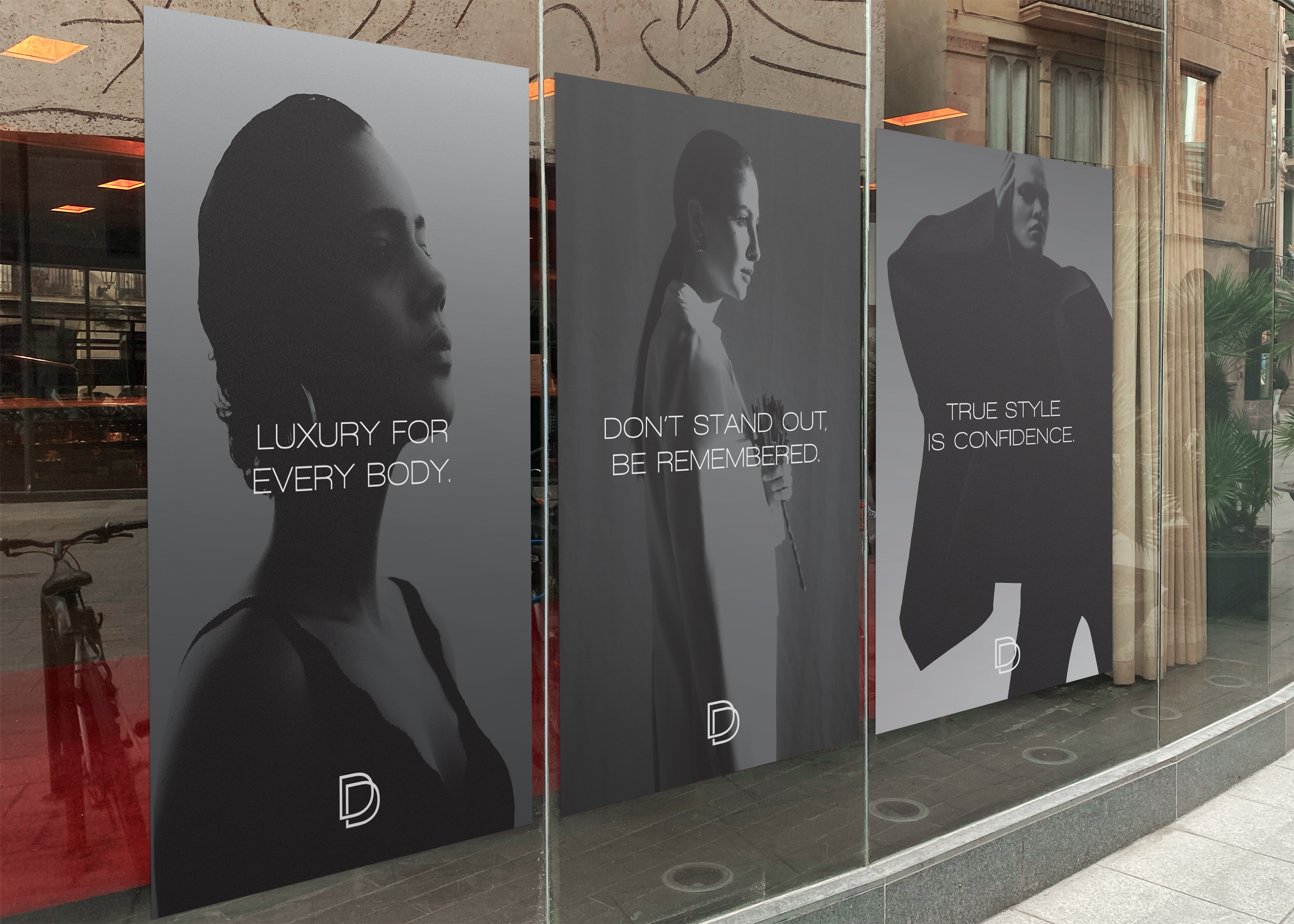
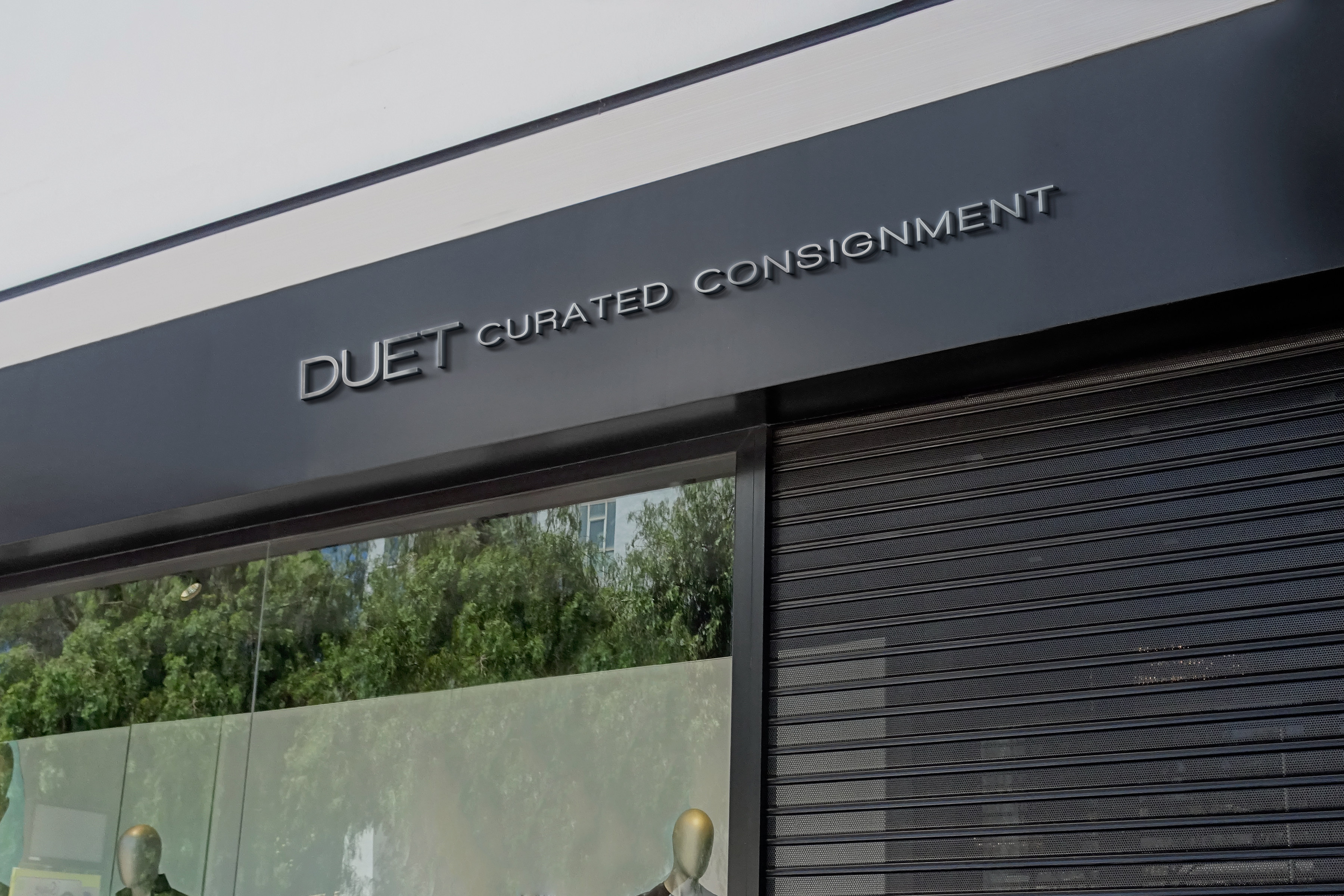
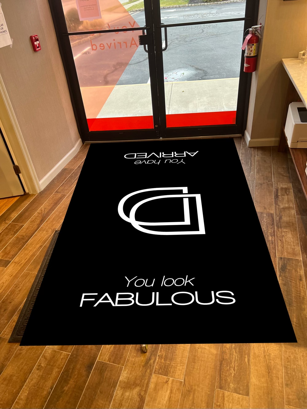
With the digital side taken care of, we turned our focus to the physical store. From window and wall signage to dressing room artwork, we made sure every person who came into contact with Duet was enveloped in its new brand sentiment and feel. Each piece of collateral was up for grabs, and we put our spin on everything.
