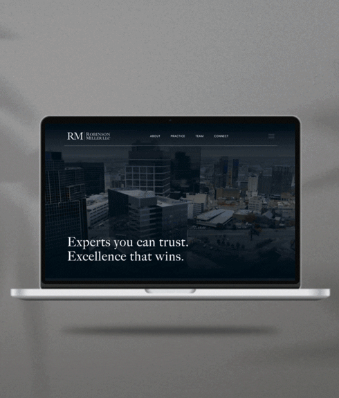
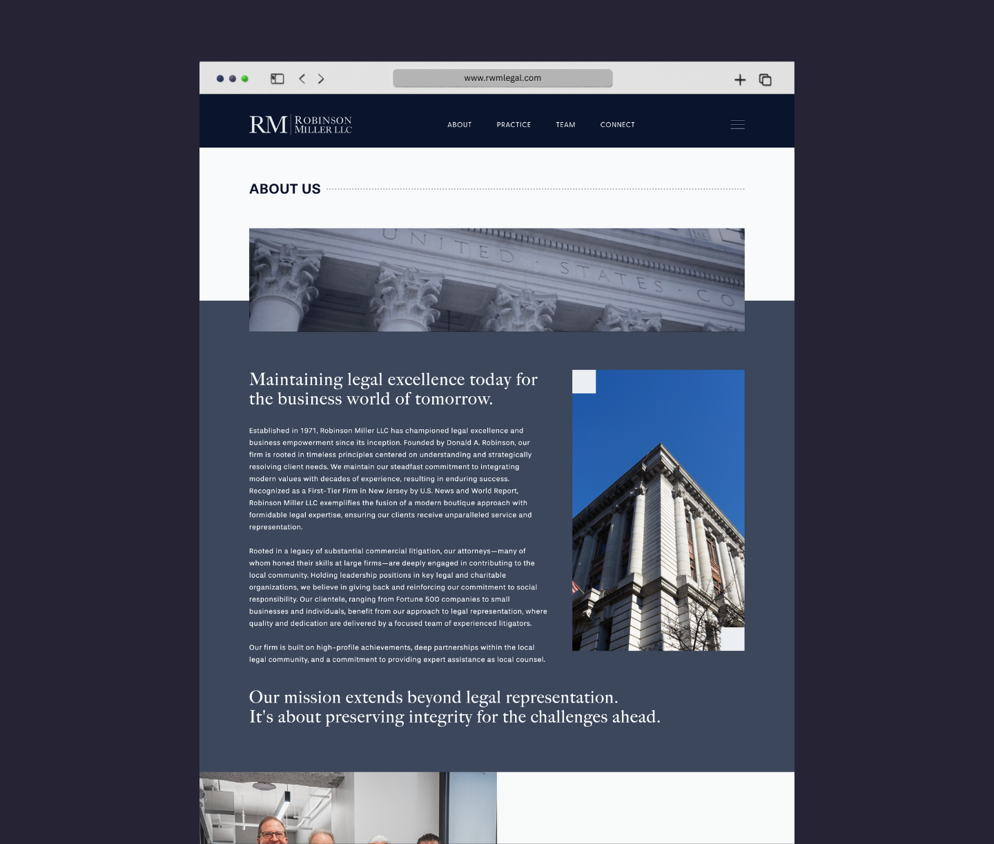
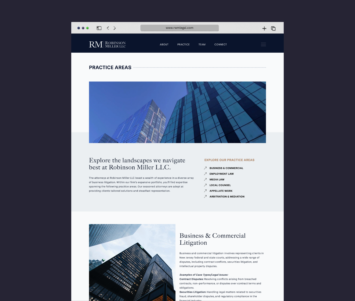
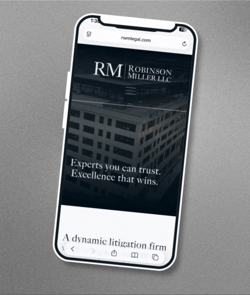
Our goal wasn’t to reinvent Robinson Miller’s identity but to extend it in meaningful ways. Building from the firm’s existing logo, we introduced a sleek serif typeface for headlines to echo its character, paired with a refined color palette and supporting typography that balanced authority with approachability. The logo itself became a design element, appearing as a subtle watermark in the mobile sliding-drawer menu to reinforce the brand across touchpoints.
These choices, combined with refreshed copy and striking visuals, transformed the site from static and dated to dynamic and engaging. With mobile-friendly functionality, clear navigation, and new photography—including headshots, group portraits, and local imagery—the site now tells a compelling story about the firm’s legacy, expertise, and deep ties to Newark’s business community. For MAVE, the project was also a full-circle moment—showcasing the dual role we play as both IT partner and creative studio. By bringing together infrastructure and identity, we helped Robinson Miller step confidently into the next decade, better positioned to attract top-tier clients and talent with a site that feels authoritative, contemporary, and distinctly their own.