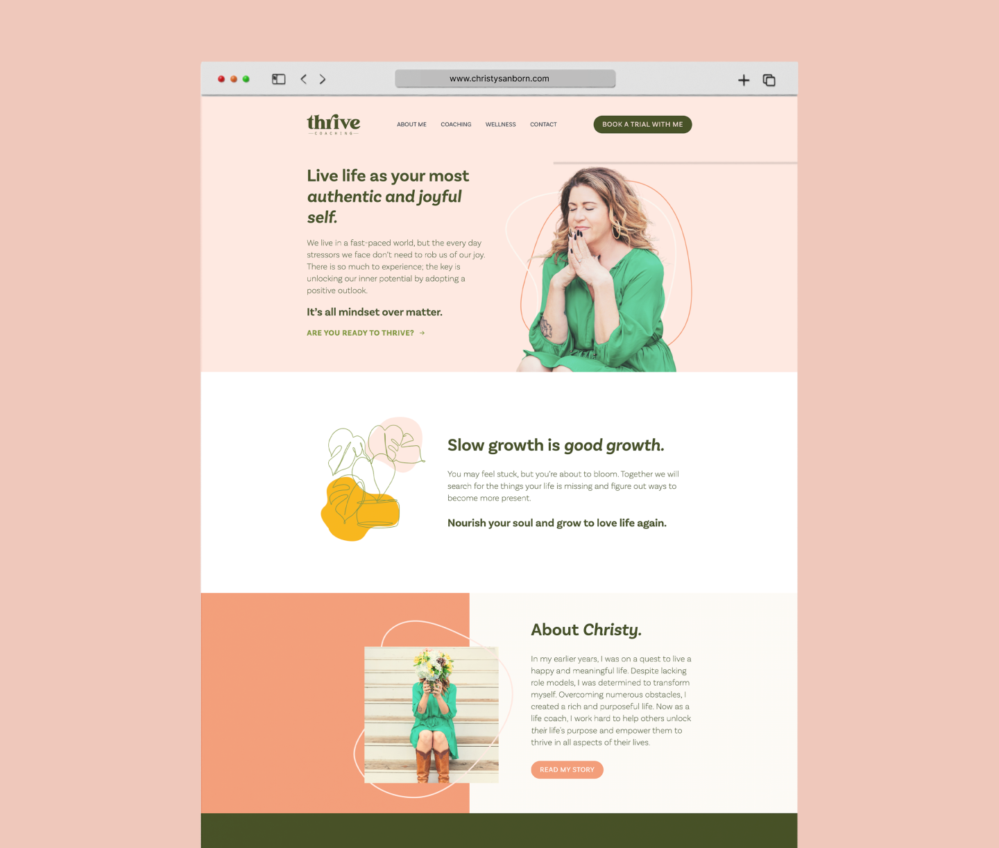
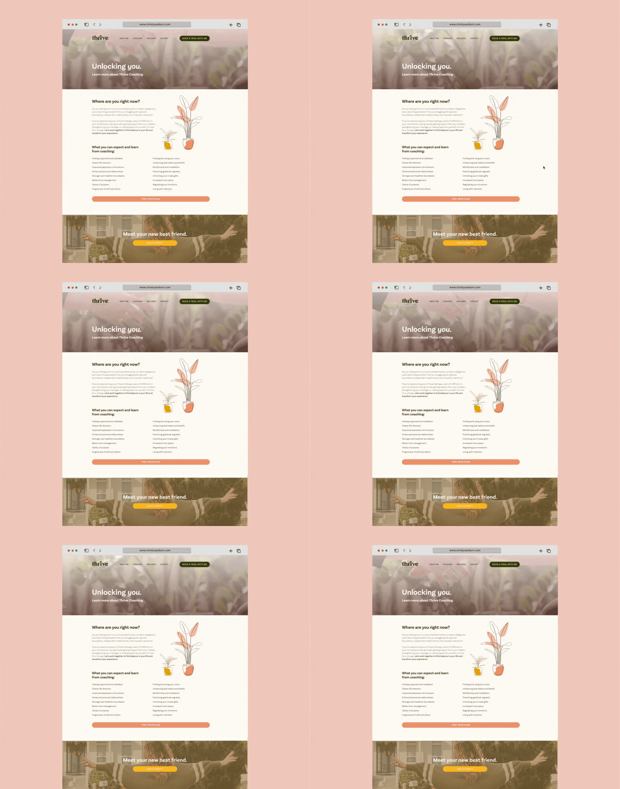
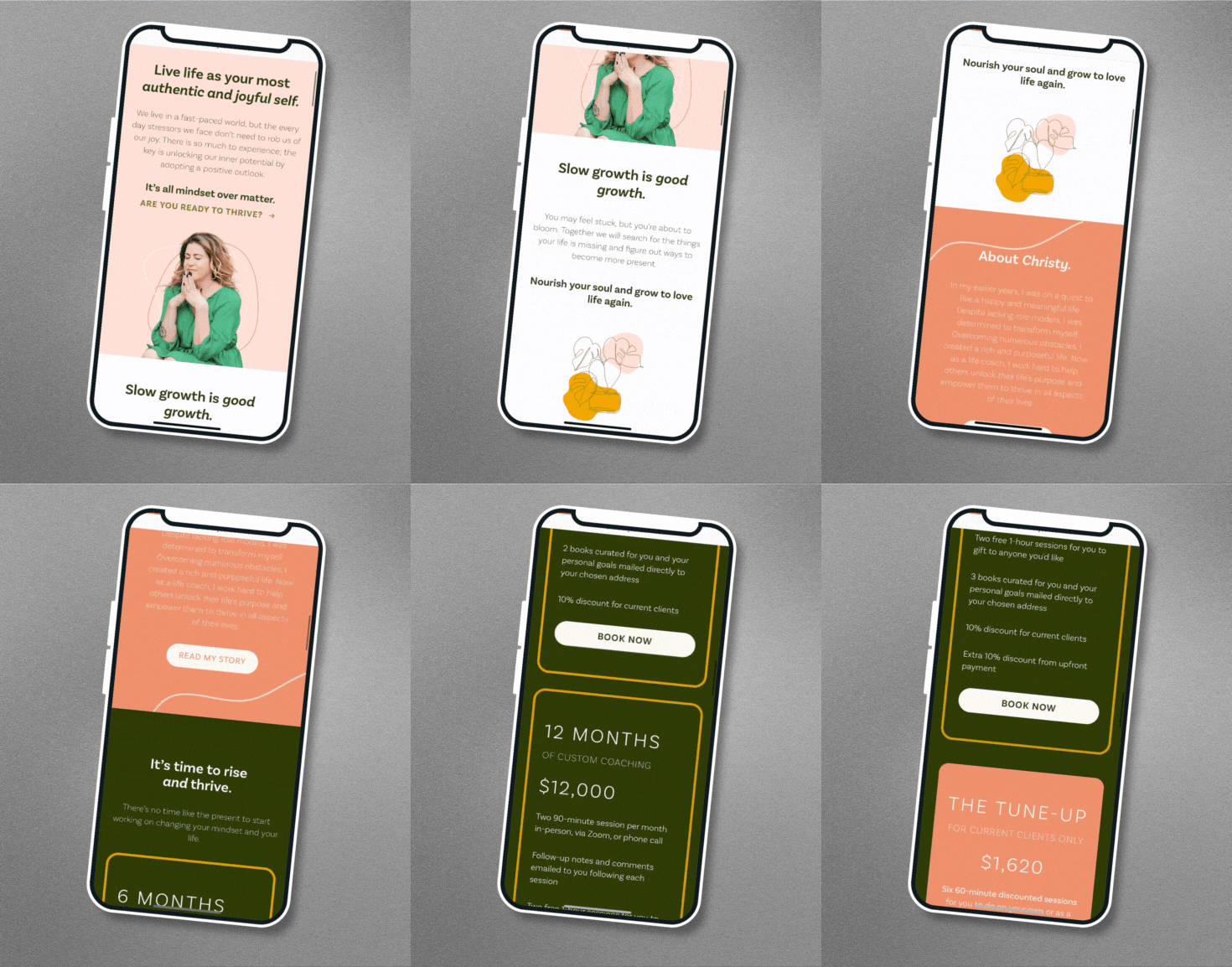
We leaned into the retro vibes of her logo and crafted a color palette of warm, plant-inspired tones—think corals, pinks, rich greens, and sumptuous tans. Paired with delicate botanical line drawings, the design captures the essence of growth and patience—exactly what Thrive is all about.
For typography, we chose Basic Sans—a clean, versatile font that gives a nod to retro aesthetics with its minimal, geometric form. Its timeless, approachable style grounded the site’s design, balancing the vintage feel with a modern, professional edge.
On top of that, we completely rewrote the site’s messaging to better tell Christy’s story, clearly showcasing her coaching packages. One of the most exciting pieces? Integrating a Wellness Shop that solidified her holistic approach to mind, body, and spirit healing. With video headers, seamless mobile functionality, and a user-friendly structure, we helped Thrive level up in a way that was both beautiful and professional.
At the end of the day, we made sure Christy’s dream site didn’t just look good but felt like the natural extension of her brand — an inviting space for anyone ready to take their next step.
When I launched my life coaching business in 2020, I knew I needed a strong, cohesive brand to stand out. I turned to Marco and Jade at MAVE, and they delivered beyond expectations. They didn’t just design a website—they crafted a complete brand system that brought my vision to life, from the logo to the user experience. Their expertise made the entire process smooth and stress-free, resulting in a website and brand that truly reflect my unique approach. I highly recommend MAVE to anyone looking to build a powerful, professional brand presence.
Christy Sanborn
Owner, Thrive Coaching LLC


